FastFlow (FF) and MomoFlow (MF) are two core features of BigShort's trading toolkit, designed to provide insights into market activity and enhance your decision-making process. Understanding the differences between these two indicators will help you interpret market signals more effectively and build a balanced trading strategy.
What Is MomoFlow?
MomoFlow (sometimes called "momo" or "shadow bars" by our users) represents emotional, discretionary buying and selling activity. It includes orders from retail traders and "blocky" orders from larger investors, referred to by our founder as "dumb big money." This flow is driven by human speculation about price direction, making it slower and more deliberate compared to automated strategies.
💡 Tip: Since MF is a proxy for dumb money, it is usually an inverse indicator. If you see a big shadow bar pointing down, that means momo is dumping, and market makers are buying the dump. Think of it as a seesaw: the more the momo majority is on one side, the less room there is for a further move in that price direction, and the more incentive market makers have to take price in the opposite direction.
Key Characteristics of MomoFlow
-
Human-driven speculation: Reflects sentiment-driven trading from retail and institutional investors.
-
Ticker-specific behavior: MomoFlow is a inverse indicator for many tickers, but other tickers seem to be driven by Momo activity
-
Day-specific trends: Though MomoFlow tends to be a good inverse indicator for SPY, it reverses on Mondays and tends to drive action, often referred to as "Momo Mondays."
-
Predictive power: In the short term, MomoFlow can provide actionable insights, especially for tickers like SPY. It's also good to see multiple shadow bars pointing in the same direction in succession, this strengthens the signal.
Warnings When Using MomoFlow
-
Be cautious of Momo Mondays—ensure that other indicators, like NOF, don't counteract MomoFlow signals.
-
Some tickers may behave differently from SPY; historical charts can help identify patterns for individual tickers.
💡 Tip: Price movement on some tickers is much more driven by MomoFlow activity than others. Make sure you are reading our Member's Only Discord to benefit as the community discovers these opportunities.
What Is FastFlow?
FastFlow reflects algorithmic, automated trading activity. It often includes high-frequency trading (HFT) strategies, rotational strategies, and hedging mechanisms executed by market makers, mega funds, and other sophisticated participants. This flow is more formulaic and emotion-free.
Key Characteristics of FastFlow
-
Algorithmic strategies: Driven by predefined rules and formulas, not human discretion.
-
Manipulative potential: FastFlow can sometimes represent "fake" or manipulative activity aimed at influencing price discovery.
💡 Tip: Disregard FastFlow, especially new users. It's algorithmic and too fast to front-run. Instead, watch the MomoFlow—Momo trades with human reaction times, making them easier to track.
Reading FastFlow and MomoFlow Charts
The easiest place to see FastFlow and MomoFlow is in the FF Segregated tab. As the name implies, in this section, FastFlow and MomoFlow are separated into two graphs for ease of analysis.
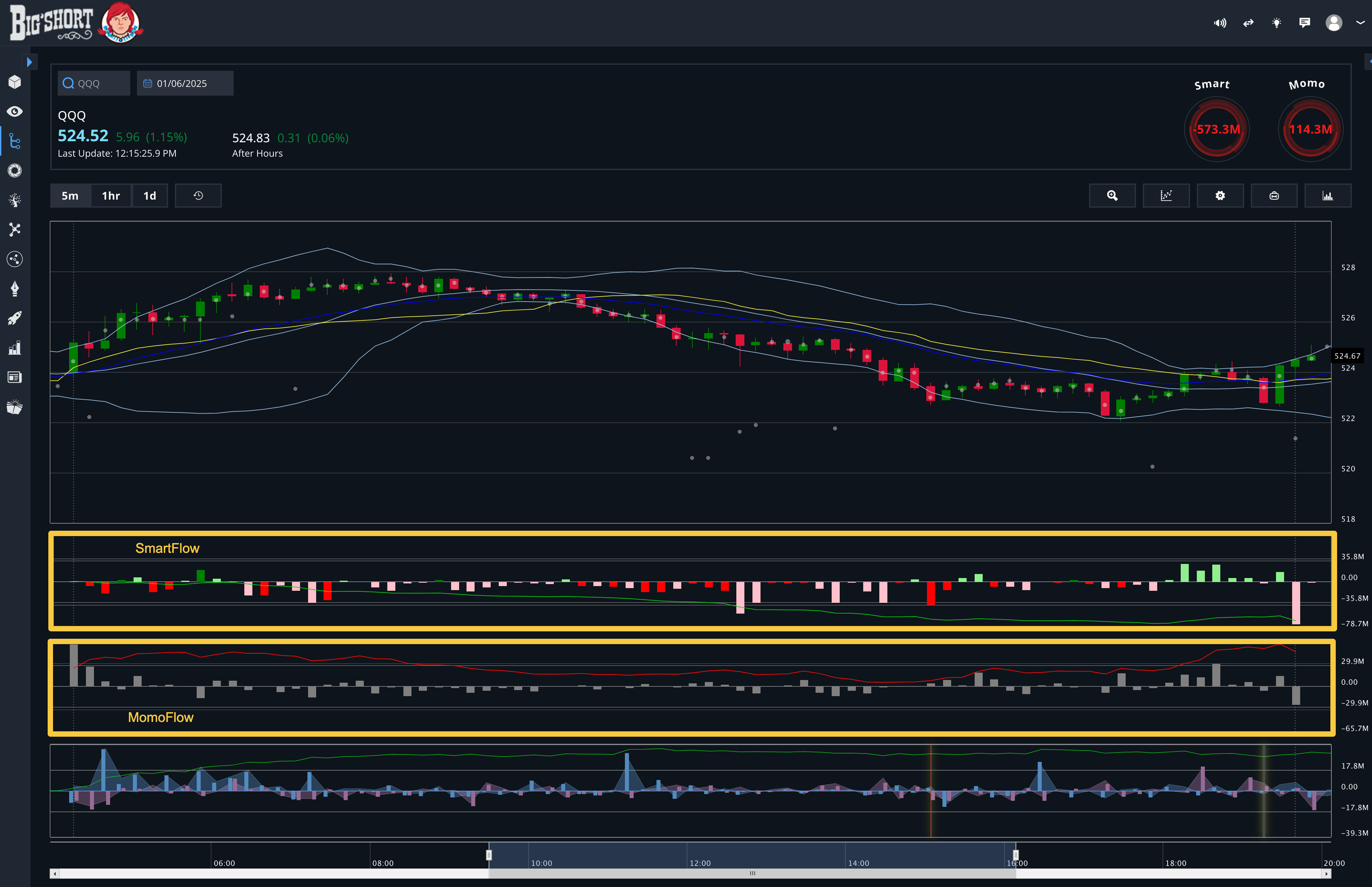
FastFlow Chart
As with other many charts in BigShort, pointing up denotes buying and pointing down denotes selling.
There are four possible colors of the bars on this chart:
-
Dark Green: FastFlow is buying and MomoFlow is selling
-
Light Green: FastFlow is buying and MomoFlow is also buying
-
Red: FastFlow is selling and MomoFlow is buying
-
Pink: FastFlow is selling and MomoFlow is also selling
The green line on the chart is the accumulation tally of the activity on the chart, allowing you to clearly see the direction and overall behavior of the day.
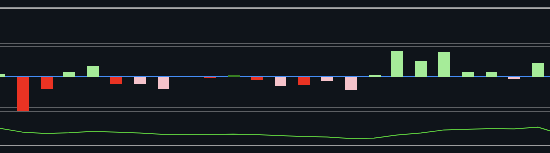
🔎 Looking Deeper: Just because FastFlow and MomoFlow are pointing the same direction doesn't mean their levels are the same. FF could be buying a little while MF is buying a lot, or visa versa.
MomoFlow Chart
Here also, bars pointing up denotes buying and bars pointing down denotes selling. These bars are always grey, leading to their nickname among our users: Shadow Bars.
The red line on the chart is the accumulation tally of the activity on the chart, allowing you to clearly see the direction and overall behavior of the day.
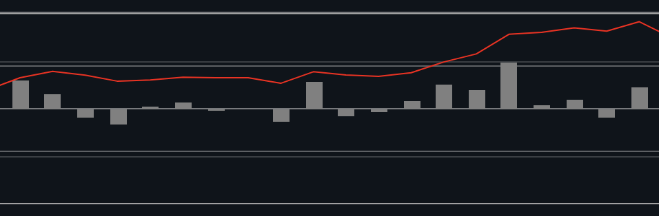
💡 Tip: Confluence is king! When Momo signals agree with Dark Pool or NOF, that's powerful. When all three agree that can be a very reliable signal of upcoming price movement.
Combined Chart
You can also view FastFlow and MomoFlow data in the FastFlow tab of BigShort. Unlike in FF Segregated, in this section, the charts are combined.
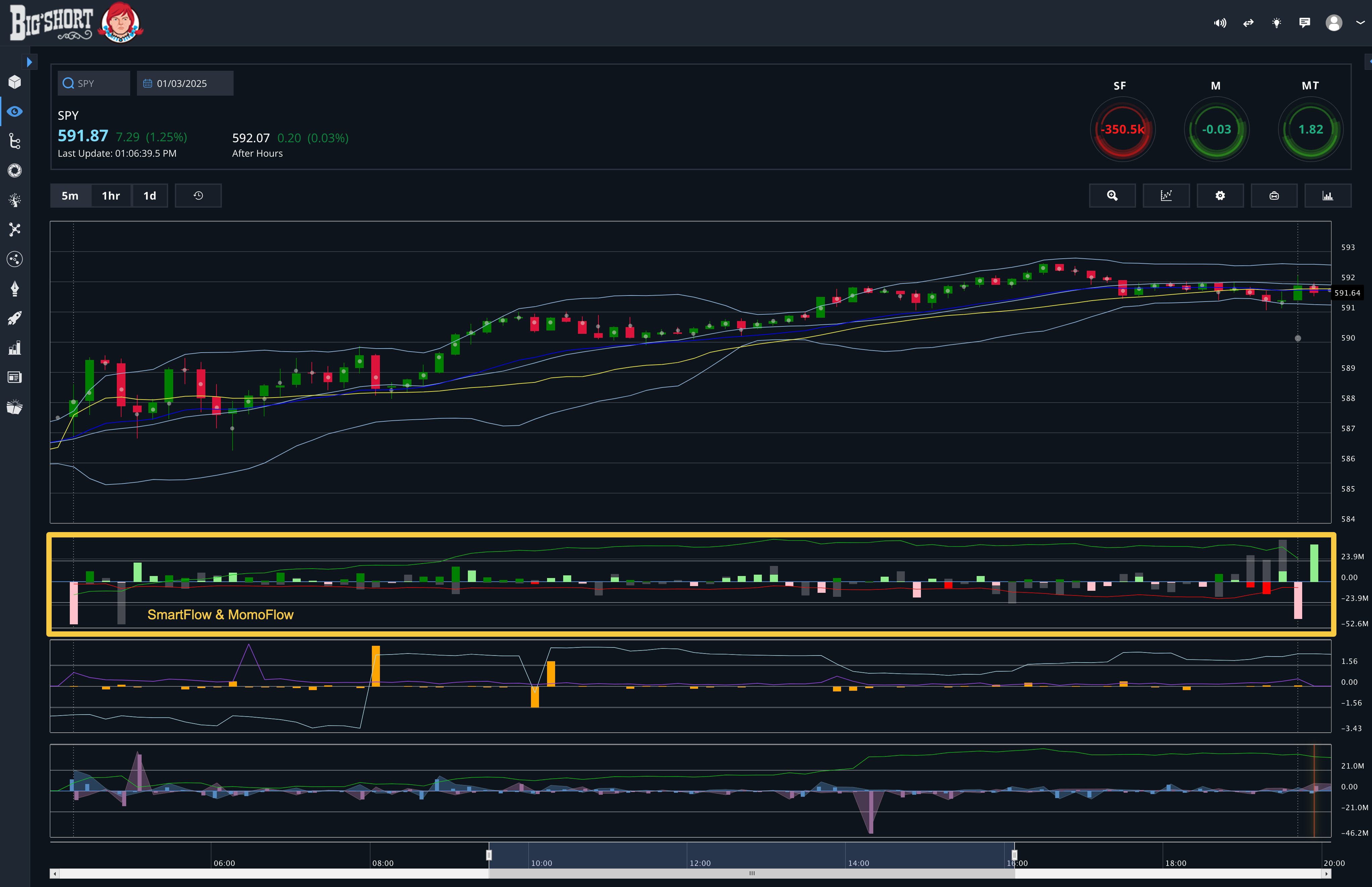
The colors coding in this chart are the same as in FF Segregated.
-
Dark Green Bar: FastFlow is buying and MomoFlow is selling
-
Light Green Bar: FastFlow is buying and MomoFlow is also buying
-
Red Bar: FastFlow is selling and MomoFlow is buying
-
Pink Bar: FastFlow is selling and MomoFlow is also selling
-
Green Line: accumulation of FastFlow
-
Red Line: accumulation of MomoFlow
Since these graphs are combined, you can directly see the differences in value for FastFlow and MomoFlow. Like in this example:
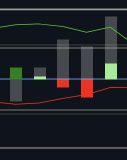
In the last bar here you can see that while both MF and FF are buying, but MF is buying significantly more because the shadow bar is larger than the light green bar.
💡 Tip: If you mouse over any bar, you can see the exact values of the chart data in the tooltip that appears in the upper left corner of the chart area.
Scaling Warnings for FastFlow and MomoFlow
When analyzing FastFlow and MomoFlow charts, it's important to be cautious of the autoscaling feature. Autoscaling adjusts the graph's scale based on the data in the selected timeframe, which can make certain bars appear disproportionately large. This does not always mean a significant market move; rather, the bars may simply be large relative to other activity in that specific timeframe.
What to Watch For:
-
Relative Volume: Always compare the volume to historical values for the ticker, not just the graph's visual representation.
-
Avoid Misinterpretation: A large bar on the chart might indicate a minor move when considered in the context of broader historical data.
By keeping this in mind, you can ensure a more accurate interpretation of the data and avoid being misled by scaling effects.
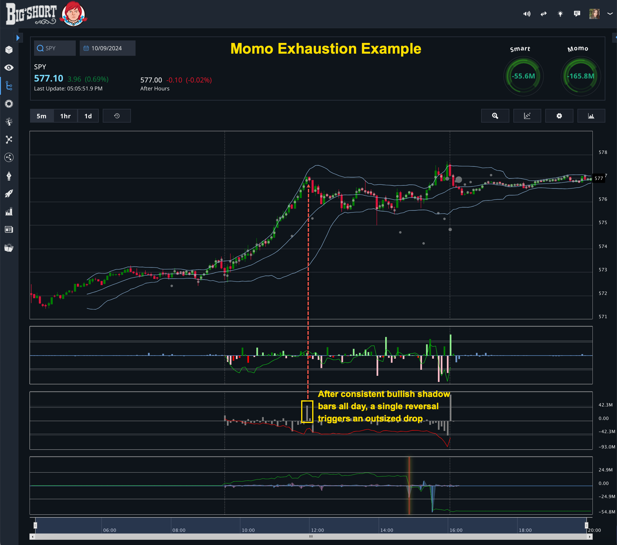
MomoFlow Exhaustion
One important theory to understand when using MomoFlow is the concept of exhaustion. When MomoFlow trends hard in one direction for an extended period, it can signal that the market is becoming overextended. A reversal in the opposite direction often results in an outsized move.
This occurs because when one side of the market becomes too crowded, a smaller volume of trades in the opposite direction can trigger a significant reversal. Think of it like two opponents pushing against each other: when one side exerts all their strength and becomes tired, the other side can easily push the other with much less effort.
Key Takeaways:
-
Monitor sustained trends in MomoFlow to identify potential exhaustion points.
-
Be prepared for sharp reversals if the indicator begins to shift in the opposite direction.
-
Use historical charts to better understand how exhaustion patterns develop for specific tickers.
Balancing FastFlow and MomoFlow
Both FastFlow and MomoFlow are essential for comprehensive market analysis. MomoFlow helps you understand human sentiment and discretionary moves, while FastFlow offers a window into algorithmic and potentially manipulative activities. Together, they provide a balanced view of market dynamics.
As BigShort's founder often notes, neither flow tells the whole story on its own. Use them alongside other BigShort indicators, such as NOF and dark pool data, to form a complete picture of market activity.