Introduction
As stated in our New User Guide, we recommend that new users start in this section for ease.
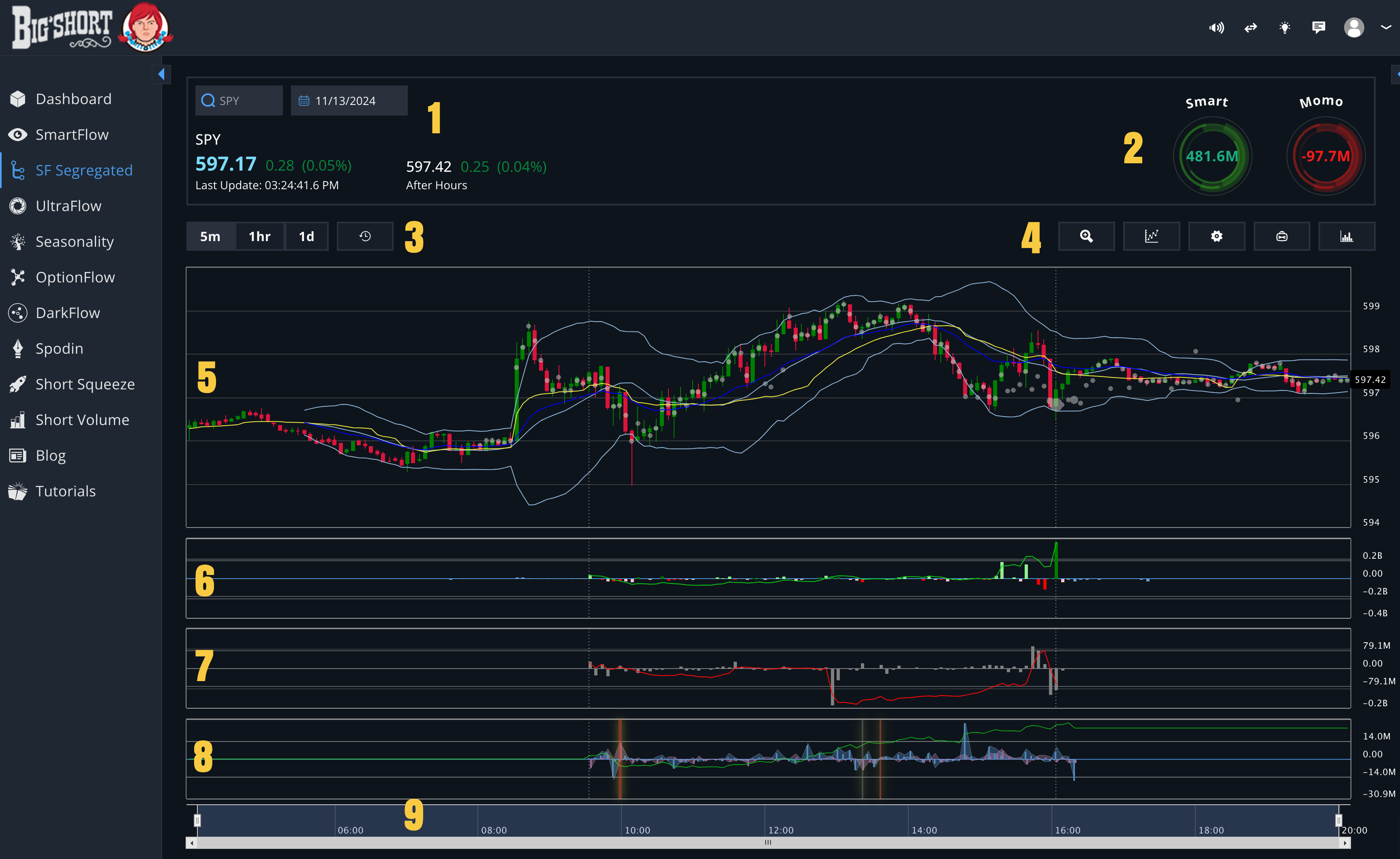
1. Date & Ticker
In the upper left you can select any ticker on the NASDAQ or NYSE and the date you want to view. It will default to today's date.
This area also shows the current price information for the selected ticker.
2. FastFlow and MomoFlow Highlights
If you are looking at today, these two gears show the current FF and MF accumulation tallies. This gives a quick-glance readout of the action of the day.
3. Chart Timeframes
These buttons allow you to switch between a 5min candle chart (default) and other times based on your needs. You can also turn a one week historical view for broader context.
4. Chart Controls
These buttons provide various additional info and chart tools.
-
Zoom : hides everything other than the charts
-
Line Tool: add a draggable, resizable line to the chart
-
Chart Settings: an assortment of settings and customizations to tailor the chart to your needs
-
Option Details: slides in a column on the right of the screen that exposes the OptionFlow data for that ticker without having to navigate to the OptionFlow tab
💡 Tip: On days where a massive NOF spike has skewed the scale of the Net Options Flow chart so much that it's impossible to read the chart well, you can experiment with turning on NOF Zoom in the chart settings. This rescales the NOF chart area and makes things easier to see. But be careful and make sure to mouse over and read the true values of the hills and bars in the tooltip when you have NOF Zoom turned on, or else you might confuse small spikes for large ones.
5. Candlestick Chart
The largest and most important pane in the chart area. Here you can see the price candlesticks and dark pools, alone with other indicators like SMA and Bollinger Bands if you have enabled them in your chart settings.
💡 Tip: As stated in our New User Guide, price is the most important indicator in trading, yet it is often overlooked by newer traders. There's a reason this chart takes up the most space on the screen!
6. FastFlow (FF)
The FastFlow chart in FF Segregated displays algorithmic trading data separately, isolating it from more discretionary flows like MomoFlow. This split allows for clearer analysis of high-frequency and automated trading activity without the influence of human-driven market sentiment. For more information on this chart, click here.
7. MomoFlow (MF, Momo, Shadow Bars)
The MomoFlow chart in FF Segregated highlights discretionary, human-driven trading activity, isolating it from more algorithmic flows like FastFlow. This focused view helps traders analyze market sentiment and identify speculative patterns without interference from automated trading data. For more information on this chart, click here.
8. Net Options Flow
The Net Options Flow (NOF) chart visualizes real-time sentiment in the options market by tracking net call and put premiums, unusual activity, and daily cumulative flow. By differentiating between buying (upward) and selling (downward) activity, the chart provides actionable insights into market trends and potential reversals. For more information on this indicator, click here.
9. Time Scaling
This slider allows you to adjust the start and/or end time of the current chart, effectively zooming in or out.