Net Option Flow: A Complete Guide
Net Option Flow (NOF) tracks real-time options activity to show which way market sentiment is actually leaning — not just how many contracts traded, but how much money moved, in which direction, and how convicted the people trading it seem to be. It's available on both the main chart and the UF Chart.
This guide walks through what NOF measures, where to find it, and how to read the chart so you can fold it into your own trading strategy.
What is Net Option Flow?
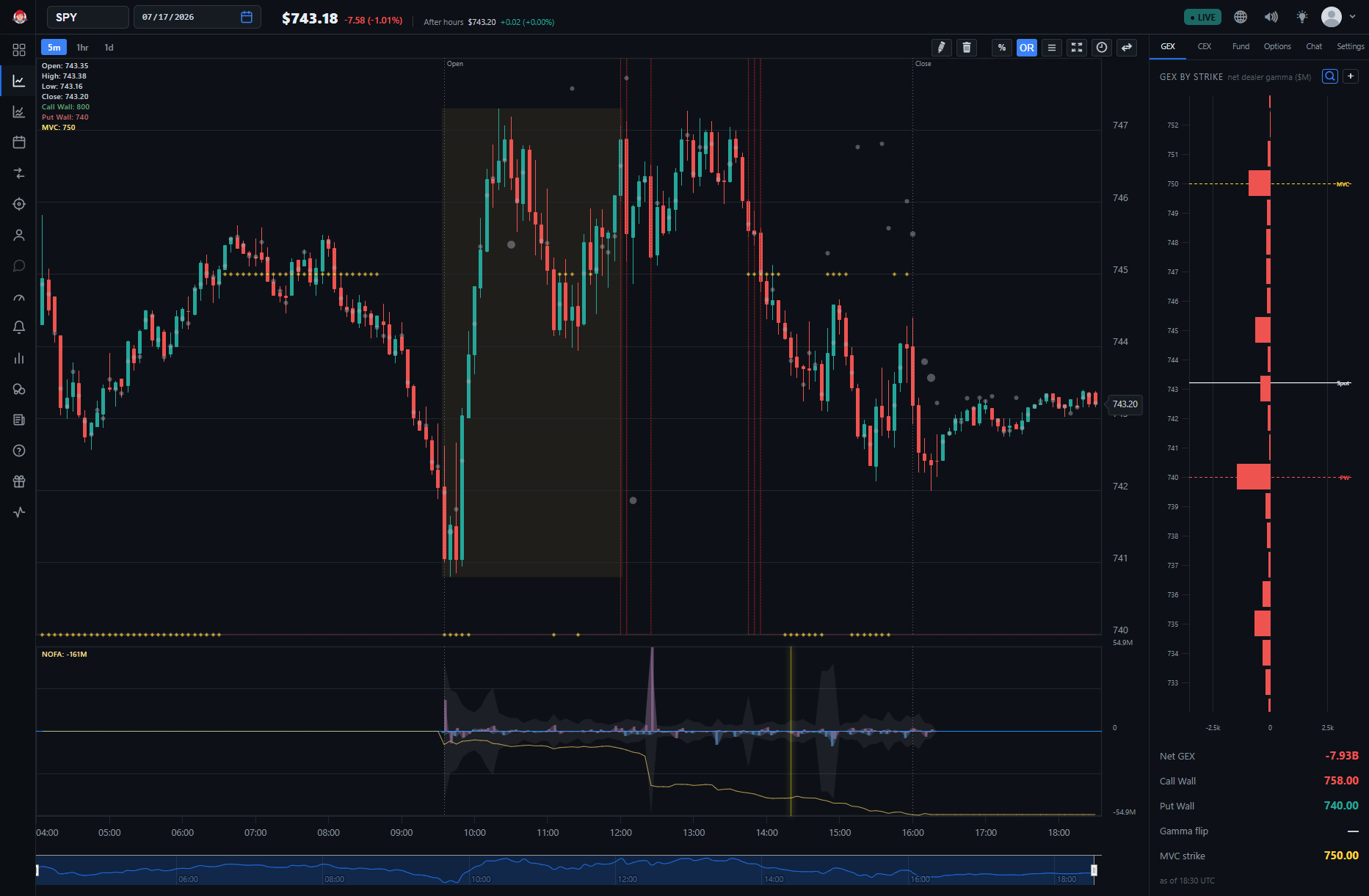
Net Option Flow visualizes activity in the options market. It tracks three key metrics:
-
Net Call/Put Flow : The net premium of all buying and selling of calls and puts.
-
Net Unusual Call/Put Premium : Net premium from large trades, such as sweeps or blocks.
-
Daily Running Accumulation of Net Call/Put Flow (NOFA) : A running tally of net premium flows over the course of the trading day.
Traditional option volume metrics have a few blind spots, and NOF was built to address them. First, plain volume treats buying and selling as identical — 1 million contracts bought and 1 million contracts sold both just count as "1 million contracts." NOF instead differentiates buys from sells, with buys pointing up and sells pointing down, so you can actually see which way sentiment is trending rather than just how busy the tape is.
Second, raw volume ignores price: 1,000 contracts bought for a penny counts the same as 1,000 contracts bought for $10. NOF weights every trade by its dollar value instead, so a handful of large, high-premium trades move the needle more than a flood of cheap, low-conviction ones — which cuts down on noise from small trades.
Third, where plain volume just adds buys and sells together, NOF nets them against each other, subtracting sells from buys. The result is a single dollar-weighted number that reflects where the money is actually flowing — into calls or puts, bullish or bearish — rather than just how much activity there was.
🚀 To the Moon: As far as we know, BigShort is still the only trading platform that layers Option Flow directly into the price chart like this, instead of sending you to a separate options-flow screen.
Where to Find the Net Option Flow Charts
The Net Option Flow chart is available on both BigShort charts, via ⚙️ Settings → Option Flow → Net Opt Flow $:
-
The main chart (app.bigshort.com/chart/SPY)
On either chart, the Net Option Flow pane visualizes the three key metrics.
On the UF Chart specifically, Net Option Flow aggregates options activity across every constituent ticker in the index — for UFSPY, that's the combined options flow of all S&P 500 names — rather than one ticker's flow alone. That index-wide aggregation is unique to BigShort.
Understanding the Net Option Flow Chart
The Net Option Flow chart consists of three primary elements: hills , bars , and the golden NOFA line.
Hills: Net Call/Put Flow
The hills represent net premium flow for calls and puts, color-coded and directional:
-
Light Blue Hills : Call flow
-
Purple Hills : Put flow
-
Direction Matters :
-
Hills pointing up indicate buying activity.
-
Hills pointing down indicate selling activity.
-
🔎 Looking Closer: In the standard BigShort 5-minute chart, each hill represents the net flow in that five minute period. That's why you will often see hills growing and shrinking during the current five minute period. Just like the price candlestick, it is a live reading of orders as they come in.
Bars: Unusual Call/Put Premium
The bars that appear with the hills highlight unusual options activity , specifically large trades:
-
Light Blue Bars : Unusual call premium
-
Purple Bars : Unusual put premium
-
Direction Matters :
-
Bars pointing up indicate buying.
-
Bars pointing down indicate selling.
-
🔎 Looking Closer: Unusual activity is defined by large trades (typically over $1M in premium), including sweeps (urgent trades across multiple exchanges), blocks (large single-exchange trades), and splits.
⚙️ Overlay control: The unusual-premium bars are governed by the Net Unusual Premium overlay option in ⚙️ Settings → Option Flow, which lets you overlay them on the standard flow pane (Net Opt Flow $), on the Martian pane (NOF $ + Martian), or turn them Off.
The Golden Line: Daily Running Accumulation (NOFA)
The golden NOFA line represents the cumulative net flow of calls and puts over the course of the trading day, tracking whether there are more dollars flowing into bullish or bearish positions. It updates in real time to provide a broader view of market sentiment. On a 5-minute chart, NOFA sitting above zero means the net sum of the day's options trades so far is positive; below zero means it's negative.
Examples
The captures below are from the v1 interface, where NOFA was drawn green — in today's app the same line is golden.
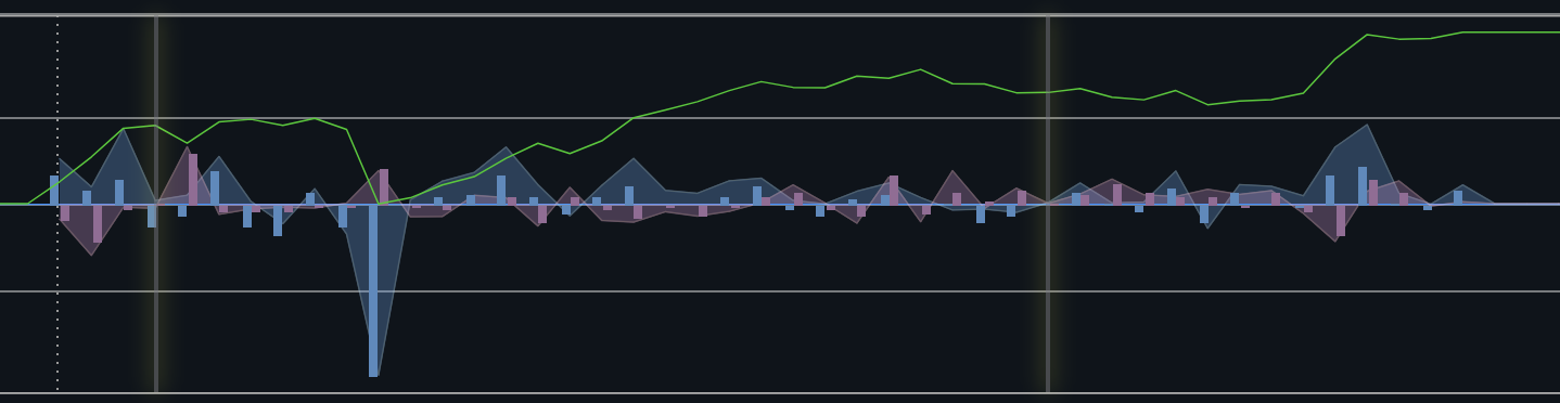
The chart above shows the Option Flow for SPY for an entire trading day. Notice the very large blue hill downward during the morning. This is showing a 5 minute period with significant call selling. You can see the corresponding plummet in the green line (NOFA) because what was otherwise a morning of net positive signals was brought basically to zero by that huge wave of selling calls.
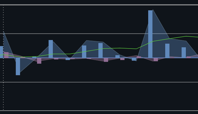
Here we can see the first 45 minutes of trading on 12/18/24 for NVDA. This morning is clearly dominated by significant call buying (and some mild put selling). Both are bullish signals.
Sweeps
From time to time you might also see colored vertical lines on the NOF chart. These indicate sweeps and are color coded.
-
Golden : a large, unusual option transaction that has been analyzed as "bullish"
-
Bronze : a large, unusual option transaction that has been analyzed as "bearish"
-
Gray : No Sentiment
How to Use Net Option Flow Effectively
Read Hills and Bars
Start with direction — hills and bars pointing up mean buying, pointing down means selling — and color: light blue is call activity, purple is put activity.
💡 Tip: While both buying and selling activity provide insights, buying is generally a stronger directional signal. For example, buying calls reflects a clear bullish sentiment, as it's an outright bet on upward price movement. Conversely, selling puts , while also bullish, can be driven by strategies like collecting premiums or managing volatility, making it less directional. Similarly, buying puts is a stronger bearish signal than selling calls , as it represents a direct bet on downward price movement.
Compare Spikes and Review the Raw Numbers
Look at the size of hills relative to previous days to gauge how significant today's activity actually is.
⚠️ Important: The Net Option Flow chart auto-scales, so a spike that looks huge on screen can be quite small relative to that ticker's normal range. This point can't be stressed enough — review historical NOF levels for the ticker you're watching so you know what actually counts as a big or small move, and mouse over the chart any time to see the raw numbers for NOF or Unusual Premium.
Know Your Ticker
Net Option Flow patterns vary across tickers — a large spike in TSLA might mean something entirely different than a similar spike in SPY or QQQ. Context is critical.
Power Hour Caution
Be cautious when interpreting Net Option Flow during the last hour of trading ("Power Hour"), since large institutional trades in that window can distort typical sentiment patterns.
Combine with Other Indicators
As always, use Option Flow alongside price action, volume, and other BigShort indicators for a comprehensive analysis. Confluence is king!
Why Net Option Flow Works
Option Flow works because options carry real information. The leverage involved means a large options trade is a genuine signal of conviction rather than money moving around idly. Direction is also unambiguous — buying calls is bullish, selling calls is bearish, buying puts is bearish, and selling puts is bullish — so there's none of the guesswork you sometimes get with raw share volume. And because big option trades often come from informed institutions or people trading with insider-level confidence, they hand retail traders a genuinely actionable signal instead of noise.
NOF Exhaustion
One important theory to keep in mind when using Net Option Flow (NOF) is the concept of NOF Exhaustion. This occurs when the indicator trends strongly in one direction for an extended period, and then begins to reverse. The resulting move in the opposite direction often tends to be outsized.
The theory behind NOF Exhaustion is that when one side of the market (buying or selling) becomes overly crowded, it can create an imbalance. A reversal is then triggered by relatively smaller volumes as the dominant side "tires out."
Picture two opponents both pulling a rope in tug of war. Person 1 is exerting 100% of their strength...pulling with everything they can. But they eventually tire out. And when they do and their muscles finally release from the effort of exertion the other opponent is going to gain a lot of ground even if they are only pulling with the same effort they were before.
Martian Net Option Flow
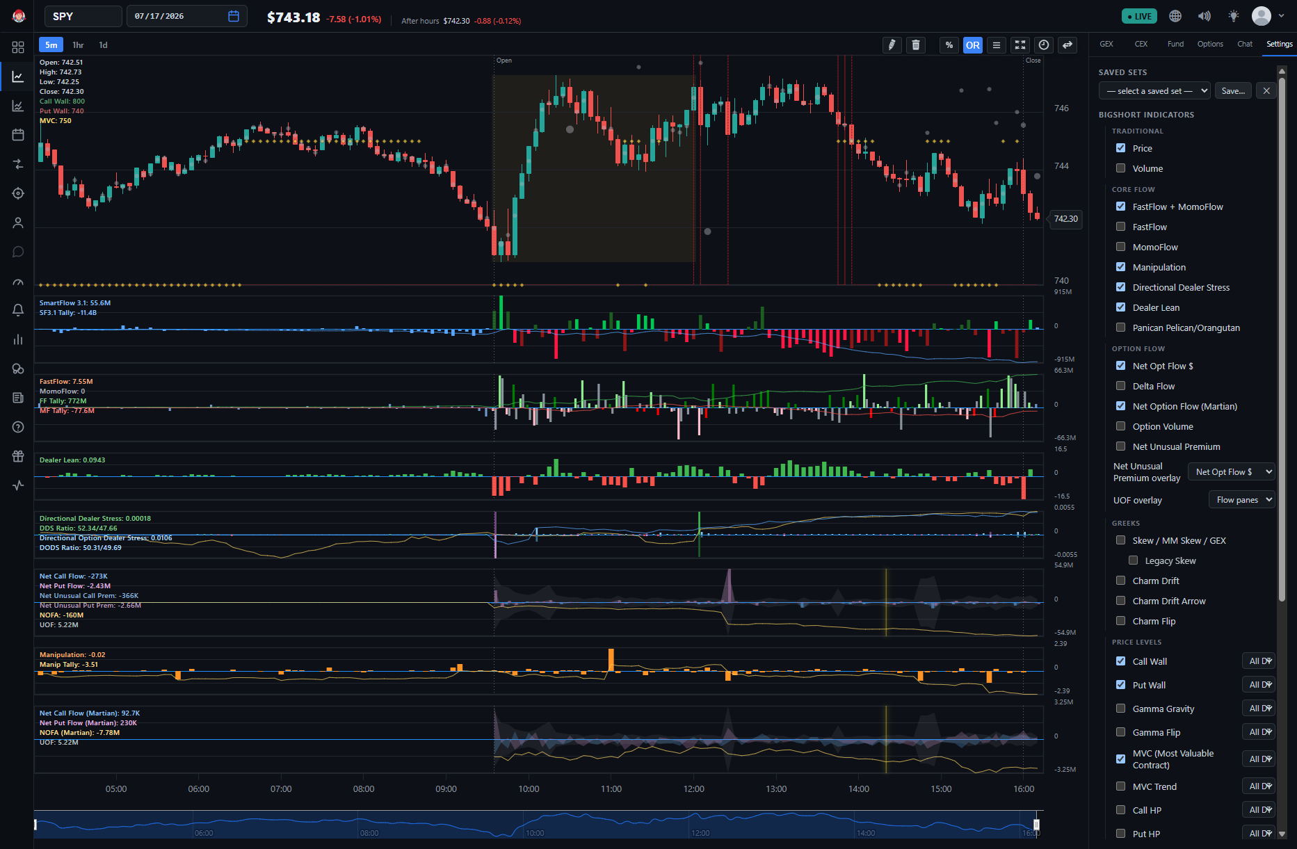
As of April 2025, "Martian Net Option Flow" and "Martian NOFA" are available in the app as Net Option Flow (Martian) under ⚙️ Settings → Option Flow, on both the main chart and the UF Chart. "Martian Net Option Flow" and "Martian NOFA" was discovered by one of our own users (@Martian) and displays Net Option Flow slightly differently by subtracting the Net Unusual Option Premium from the Net Option Flow.
NOF is made of 2 components: Regular Options Flows and Unusual Options Flows.
Classic NOF shows both together.
Martian NOF only shows Regular Options Flows. Though in the chart UO bars are still shown, they are not used for the hills or NOFA.
To activate it, go to ⚙️ Settings → Option Flow and enable "Net Option Flow (Martian)". Using both can yield additional insights to advanced users.
One Thing to Remember
NOF is at its best in combination — with price action, with the other Core Flow indicators, and with itself over time (today's spike measured against this ticker's own history), rather than as a signal to trade in isolation.
If you haven't already, check out our Guide for New Users to see how NOF fits into an overall strategy.